Category: Computers

  • All In on Artificial Intelligence

    An anthropomorphic cat wearing coveralls, working with advanced computers. Image generated with Stable Diffusion.

    As I wrote about recently about my summertime studying and documented on my generative artificial intelligence (AI) bibliography, I am learning all that I can about AI–how it’s made, how we should critique it, how we can use it, and how we can teach with it. As with any new technology, the more that we know about it, the better equipped we are to master it and debate it in the public sphere. I don’t think that fear and ignorance about a new technology are good positions to take.

    I see, like many others do, that AI as an inevitable step forward with how we use and what we can do with computers. However, I don’t think that these technologies should only be under the purview of big companies and their (predominantly) man-child leaders. Having more money and market control does not mean one is a more ethical practitioner with AI. In fact, it seems that some industry leaders are calling for more governmental oversight and regulation not because they have real worries about AI’s future development but instead because they are in a leadership position in the field and likely can shape how the industry is regulated through industry connections with would-be regulators (i.e., the revolving door of industry-government regulation in other regulatory agencies).

    Of course, having no money or market control in AI does not mean one is potentially more ethical with AI either. But, ensuring that there are open, transparent, and democratic AI technologies creates the potential for a less skewed playing field. While there’s the potential for abuse of these technologies, having these available to all creates the possibility for many others to use AI for good. Additionally, if we were to keep AI behind locked doors, only those with access (legally or not) will control the technology, and there’s nothing to stop other countries and good/bad actors in those countries from using AI however they see fit–for good or ill.

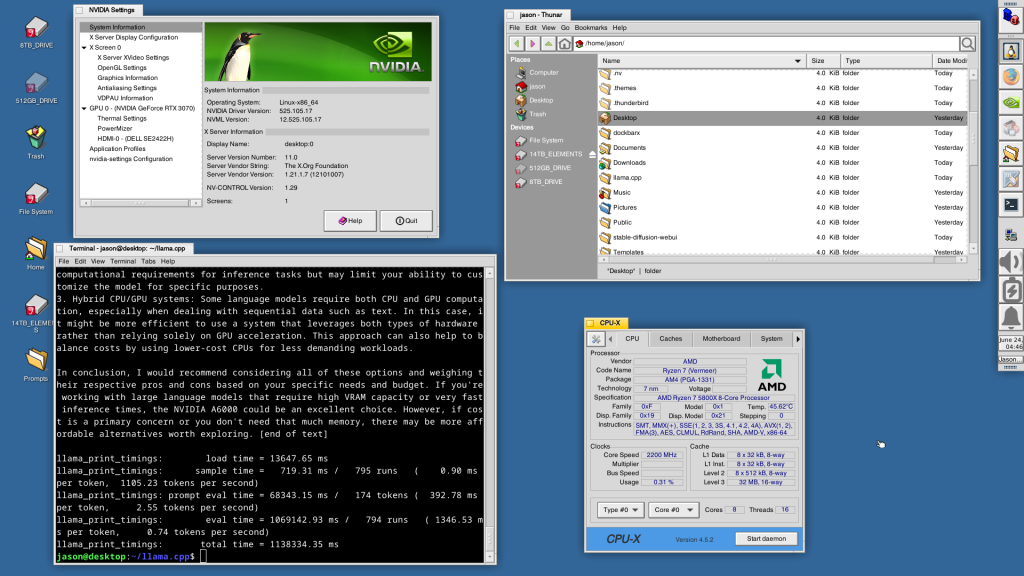
    To play my own small role in studying AI, using generative AI, and teaching about AI, I wanted to build my own machine learning-capable workstation. Before I made any upgrades, I maxed out what I could do with a Asus Dual RTX 3070 8GB graphics card and 64GB of RAM for the past few months. I experimented primarily with Stable Diffusion image generation models using Automatic1111’s stable-diffusion-webui and LLaMA text generation models using Georgi Gerganov’s llama.cpp. An 8GB graphics card like the NVIDIA RTX 3070 provides a lot of horsepower with its 5,888 CUDA cores and memory bandwidth across its on-board memory. Unfortunately, the on-board memory is too small for larger models or adjusting models with multiple LORA and the like. For text generation, you can layer some of the model on the graphic’s card memory and your system’s RAM, but this is inefficient and slow in comparison to having the entire model loaded in the graphics card’s memory. Therefore, a video card with a significant amount of VRAM is a better solution.

    Previous interior of my desktop computer with air cooling, 128GB RAM, and Asus Dual Geforce RTX 3070 8GB graphics card.

    For my machine learning focused upgrade, I first swapped out my system RAM for 128GB DDR4-3200 (4 x 32GB Corsair shown above). This allowed me to load 65B parameters into system RAM with my Ryzen 7 5800X 8 core/16 thread CPU to perform the operations. The CPU usage while it is processing tokens on llama.cpp looks like an EEG:

    CPU and memory graphs show high activity during AI inference.

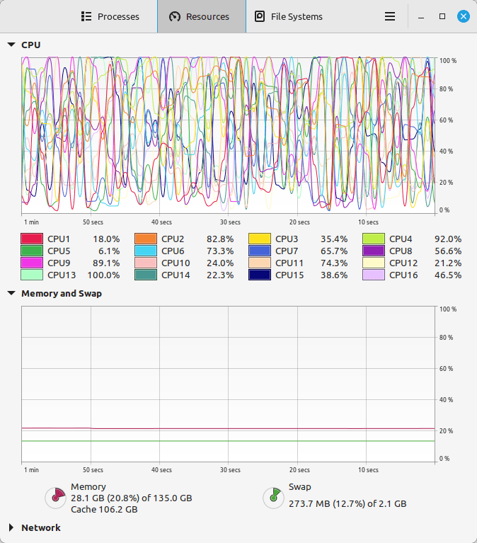
    While running inference on the CPU was certainly useful for my initial experimentation and the CPU usage graph looks cool, it was exceedingly slow. Even an 8 core/16 thread CPU is ill-suited for AI inference in part due to how it lacks the massive parallelization of graphics processing units (GPUs) but perhaps more importantly due to the system memory bottleneck, which is only 25.6 GB/s for DDR4-3200 RAM according to Transcend.

    Video cards, especially those designed by NVIDIA, provide specialized parallel computing capabilities and enormous memory bandwidth between the GPU and video RAM (VRAM). NVIDIA’s CUDA is a very mature system for parallel processing that has been widely accepted as the gold standard for machine learning (ML) and AI development. CUDA is unfortunately, closed source, but many open source projects have adopted it due to its dominance within the industry.

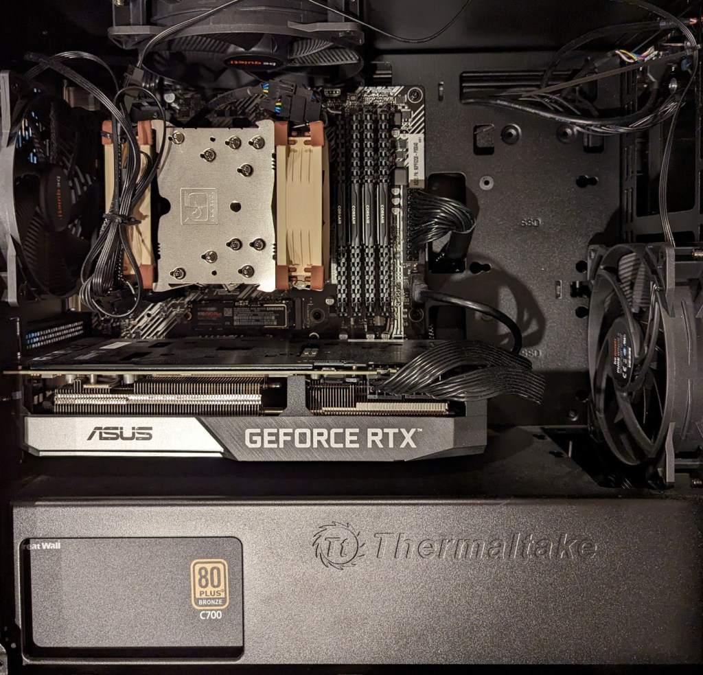
    My primary objective when choosing a new video card was that it had enough VRAM to load a 65B LLaMA model (roughly 48GB). One option for doing this is to install two NVIDIA RTX 3090 or 4090 video cards with each having 24GB of VRAM for a total of 48GB. This would solve my needs for running text generation models, but it would limit how I could use image generation models, which can’t be split between multiple video cards without a significant performance hit (if at all). So, a single card with 48GB of VRAM would be ideal for my use case. Three options that I considered were the Quadro 8000, A40, and RTX A6000 Ampere. The Quadro 8000 used three-generation-old Turing architecture, while the A40 and RTX A6000 used two-generation-old Ampere architecture (the latest Ada architecture was outside of my price range). The Quadro 8000 has memory bandwidth of 672 GB/s while the A40 has 696 GB/s and the A6000 has 768 GB/s. Also, the Quadro 8000 has far fewer CUDA cores than the other two cards: 4,608 vs. 10,572 (A40) and 10,752 (A6000). Considering the specs, the A6000 was the better graphics card, but the A40 was a close second. However, the A40, even found for a discount, would require a DIY forced-blower system, because it is designed to be used in rack mounted servers with their own forced air cooling systems. 3D printed solutions that mate fans to the end of an A40 are available on eBay, or one could rig something DIY. But, for my purposes, I wanted a good card with its own cooling solution and a warranty, so I went with the A6000 shown below.

    nvidia A6000 video card

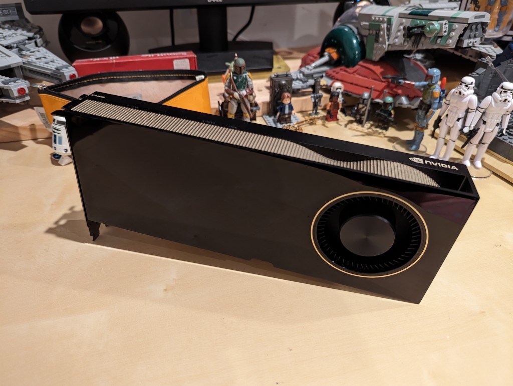
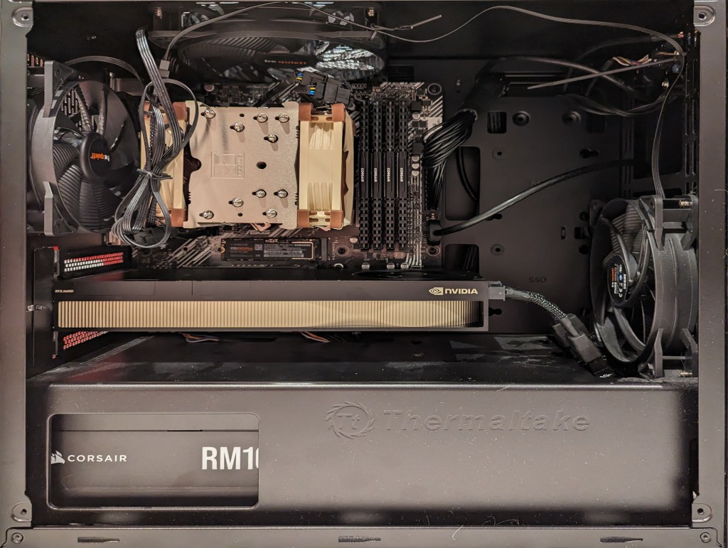
    Another benefit to the A6000 over the gaming performance-oriented 3090 and 4090 graphics cards is that it requires much less power–only 300 watts at load (vs ~360 watts for the 3090 and 450 watts for the 4090). Despite this lower power draw, I only had a generic 700 watt power supply. I wanted to protect my investment in the A6000 and ensure it had all of the power that it needed, so I opted to go with a recognized name brand PSU–a Corsair RM1000x. It’s a modular PSU that can provide up to 1,000 watts to the system (it only provides what it is needed–it isn’t using 1000 watts constantly). You can see the A6000 and Corsair PSU installed in my system below.

    new computer setup with 128GB RAM and A6000 graphics card

    Now, instead of waiting for 15-30 minutes for a response to a long prompt ran on my CPU and system RAM, it takes mere seconds to load the model on the A6000’s VRAM and generate a response as shown in the screenshot below of oobabooga’s text-generation-webui using the Guanaco-65B model quantized by TheBloke to provide definitions of science fiction for three different audiences. The tool running in the terminal in the lower right corner is NVIDIA’s System Management Interface, which can be opened by running “nvidia-smi -l 1”.

    text generation webui running on the a6000 video card

    I’m learning the programming language Python now so that I can better understand the underlying code for how many of these tools and AI algorithms work. If you are interested in getting involved in generative AI technology, I recently wrote about LinkedIn Learning as a good place to get started, but you can also check out the resources in my generative AI bibliography.

  • Summer Studying with LinkedIn Learning

    An anthropomorphic cat taking notes in a lecture hall. Image created with Stable Diffusion.

    I tell my students that I don’t ask them to do anything that I haven’t done or will do myself. A case in point is using the summer months for a learning boost. LinkedIn Learning offers new users a free trial month, which I’m taking advantage of right now.

    While I’ve recommended students to use LinkedIn Learning for free via the NYPL, completion certificates for courses don’t include your name and they can only be downloaded as PDFs, meaning you can’t easily link course completion to your LinkedIn Profile. Due to the constraints with how library patron access to LinkedIn Learning works, I opted to try out the paid subscription so that it links to my LinkedIn Profile. However, I wouldn’t let these limitations hold you back from using LinkedIn Learning via the NYPL if that is the best option for you–just be aware that you need to download your certificates and plan how to record your efforts on your LinkedIn Profile, your resume, and professional portfolio.

    After a week of studying, I’ve earned certificates for completing Introduction to Responsible AI Algorithm Design, Introduction to Prompt Engineering for Generative AI, AI Accountability Essential Training. And, I passed the exam for the Career Essentials in Generative AI by Microsoft and LinkedIn Learning Path. I am currently working on the Responsible AI Foundations Learning Path. These courses support the experimentation that I am conducting with generative AI (I will write more about this soon), the research that I am doing into using AI pedagogically and documenting on my generative AI bibliography, and thinking how to use AI as a pedagogical tool in a responsible manner.

    For those new to online learning, I would make the following recommendations for learning success:

    1. Simulate a classroom environment for your learning. This means find a quiet space to watch the lectures while you are watching them. Don’t listen to music. Turn off your phone’s notifications. LinkedIn courses are densely packed with tons of information. Getting distracted for a second can mean you miss out on something vital to the overall lesson.
    2. Have a notebook and pen to take notes. While watching the course, pause it to write down keywords, sketch charts, and commit other important information to your notes. The act of writing notes by hand has been shown to improve your memory and recall of learned information. Don’t keep notes by typing as this is less information rich learning than writing your notes by hand.
    3. Even though a course lists X hours and minutes to completion, you should budget at least 50% more time in addition to that time for note taking, studying, quizzes, and exams (for those courses that have them).
    4. While not all courses require you to complete quizzes and exams for a completion certificate, you should still take all of the included quizzes and exams. Research shows that challenging ourselves to recall and apply what we’ve learned via a test helps us remember that information better.
    5. After completing a course, you should add the course certificate to your LinkedIn Profile, post about completing the course (others will give you encouragement and your success might encourage others to learn from the same course that you just completed), add the course certificate to your resume, and think about how you can apply what you’ve learned to further integrate your learning into your professional identity. On this last point, you want to apply what you’ve learned in order to demonstrate your mastery over the material as well as to fully integrate what you’ve learned into your mind and professional practices. This also serves to show others–managers, colleagues, and hiring personnel–that you know the material and can use it to solve problems. For example, you might write a blog post that connects what you’ve learned to other things that you know, or you might revise a project in your portfolio based on what you’ve learned.
    6. Bring what you’ve learned into your classes (if you’re still working toward your degree) and your professional work (part-time job, internship, full-time job, etc.). Learning matters most when you can use what you’ve learned to make things, solve problems, fulfill professional responsibilities, and help others.
  • Customize Xfce on Debian 12 Bookworm to Look Like BeOS and Haiku OS

    BeOS desktop image

    This weekend, I installed Debian 12 Bookworm with Xfce desktop environment on my desktop computer, because I wanted a pure Xfce installation on top of a distro running a 6.0 or higher kernel to theme as close to BeOS as I can get.

    As I’ve written about before here, I have fond memories of using BeOS on my old PowerMacintosh 8500/120. When I used it on that hardware, it felt like the future. Many of its features were ahead of its time for a desktop computing environment. It was also incredibly easy to navigate and interact with due to its colors, icons, and textured UI elements.

    I believe that BeOS and Haiku OS have GUIs that are easy to see and interact with, because they aren’t flattened to death like most contemporary operating systems, which have less contrast and textured borders that hinder visual comprehension and interaction.

    I tried installing Xubuntu, but after installation, I was greeted by the login prompt, I entered my credentials, received a black screen (NB: not rebooting–for some reason the DE wouldn’t launch and it would kick me back to the login screen), and was greeted again by the login prompt. Since that was a fresh installation, I was concerned about the long-term stability of it on my computer. Hence, I tried out Debian 12, which installed and booted without a hitch!

    In addition to reinstalling Automatic1111 for Stable Diffusion for AI image generation and Llama.cpp for AI text generation, I set about theming Xfce to look as much like BeOS as possible.

    I describe step-by-step how to make Xfce mimic BeOS in the sections below.

    Window Manager Theme

    Window Manager window

    Perhaps the most notable aspect of BeOS/Haiku’s look-and-feel is the yellow, tabbed window title bar. Some tutorials suggest using the BeOS-r5-XFWM theme, but I opted for the Haiku-Alpha theme, because it only keeps the close window tic box and eliminates the other options such as minimize, maximize, etc., which you can still operate by setting one option to title bar double clicks and others from the drop-down right-click menu.

    Decompress the downloaded file and move the resulting folder into ~/.themes (remember to turn on “show hidden files and folders” in your file manager, and create the .themes folder if it does not already exist). Then, go to Settings > Window Manager > select Haiku-Alpha. Also, set the font to Swis721 BT Bold size 9 (see font section below for more info).

    Appearance Theme

    Appearance window

    To give Xfce the general look-and-feel of BeOS’s relatively high contrast interface (by today’s modern, flat interface standards), I installed the BeOS-r5-GTK theme.

    Decompress the downloaded file and move the resulting folder into ~/.themes. Then, go into Settings > Appearance > Style > select BeOS-r5-GTK-master.

    Next, click on the Fonts tab. For Default Font, select Swis721 BT Regular size 9, and for Default Monospace Font, select Courier 10 Pitch Regular size 10 (see Font section below for more info).

    Fonts

    There are two essential fonts, which can be easily found through Google searches: Swis721 BT Roman and Courier 10 Pitch for Powerline.

    Once downloaded, move the ttf files into ~/.fonts (remember to turn on “show hidden files and folders” in your file manager, and create the .themes folder if it does not already exist).

    There are two main areas where the fonts need to be set. First, go to Settings > Window Manager > Style tab and set the Title font to Swis721 BT Bold size 9. Then, go to Settings > Appearance > Fonts tab and set the Default Font to Swis721 BT Regular size 9 and set the Default Monospace Font to Courier 10 Pitch Regular size 10.

    Mouse Cursors

    Mouse and Trackpad theme window

    The hand mouse cursor is an integral element of BeOS’s look-and-feel. I opted to use HaikuHand reHash.

    Decompress the downloaded file and move its folder into ~/.icons (remember to turn on “show hidden files and folders” in your file manager, and create the .themes folder if it does not already exist). Then, select HaikuHand reHash in Settings > Mouse and Touchpad > Theme.

    Icons

    Appearance Icons tab

    The isometric view icons for BeOS capture that mid-to-late-1990s era of gesturing towards 3D through 2D designs. Vaporware Mac System 8 Copland exemplified this aesthetic, too (but aspects of it found its way into the eventual MacOS 8 and others incorporated its design elements into shareware like Aaron and the Iconfactory’s innovative icon sets. I created some icons in this style, too.

    To make Xfce as BeOS-like as possible, I used the BeOS-r5-Icons pack.

    Decompress the downloaded file and move it into ~/.icons (remember to turn on “show hidden files and folders” in your file manager, and create the .themes folder if it does not already exist). Then, go to Settings > Appearance > Icons tab > select BeOS-r5-Icons.

    Desktop

    Desktop settings window

    There are BeOS desktop wallpaper pictures that you can download and set as your wallpaper. However, I wanted a simpler solid color background. To achieve this, go to Settings > Desktop. Set Style to “None,” and set Color to “Solid color.” Then, click on the color rectangle to the right of Color, and next, click on the “+” under Custom and enter this hex value for the default deep blue BeOS desktop color: #336698.

    Dock

    Dock Preferences window

    After a lot of head-hitting-the-desk, I settled on using the Xfce’s Panel instead of a more visually interesting dock that used a BeOS-inspired theme (e.g., BeOS-dr8-DockbarX). I was able to get DockbarX installed from source eventually, but I couldn’t get the Xfce4 DockbarX plugin to work with the Xfce Panel. It wasn’t from a lack of trying! It’s worth trying to get those installed–you might have better luck. For me, I needed to move on, so I settled on customizing the Xfce panel to meet my needs and fit the BeOS aesthetic well enough. I went to Settings > Panel > Display tabl to set Panel 1 in Deskbar Mode, set the Row size to 48 with 1 row and ticked “Automatically increase the length. On the Appearance tab, I set the Fixed icon size to 48.

    Applications Menu settings within Panel settings

    On the Items tab, I clicked the preferences for the Applications Menu, removed the Button title and changed the Icon to the isometric 3D Be logo (this will be an option after you’ve installed the icons pack as described above in the Icons section).

    It would be easy to configure the panel to be more like the original Deskbar in BeOS, too. The main changes needed would be to increase the Number of rows to 4 or 5, change the Application menu icon to the flat “BeOS” logo icon (included in the icon pack installation in the Icons section above).

    And, it’s important to remember that there was not one, eternal version of BeOS. As with any developed software, it changed over time with its UI and look-and-feel changing with it. For me, the 1996 Developer Release is what I remember most because I ran it on bare metal on my PowerMacintosh 8500/120. It continued to evolve and change after that in ways that I am less familiar with.

    QMMP/Winamp Skin

    If you use QMMP for listening to music on your computer, you’ll need to grab a Winamp skin to give it the BeOS look and title bar. BeAmp Too is my favorite. There are a few others available if you search for “beos” on the Winamp Skin Museum.

    Whichever one you choose, download the zip file for the theme to your Downloads folder. Then, open QMMP, right click on the title bar and choose Settings, click on the Appearances section on the left, click the Skins tab, and then click on “Add…” at the bottom, navigate to your downloaded theme zip file and select it. QMMP will copy the file into the ~/.qmmp/skins directory for you. Select the theme on the Appearances > Skins tab to activate the theme.

    Other Tweaks

    The following are other tweaks to Xfce that I prefer for daily use.

    Disable overlay/auto hiding scrollbars

    Edit /etc/environment and add the line

    GTK_OVERLAY_SCROLLING=0 

    Save the file. Logout and login to see the change take effect.

    White font for desktop items

    Go to ~/.config/gtk-3.0/ and create a file named gtk.css (edit this file if it already exists). Add these lines to it:

    XfdesktopIconView.label {
        color: white;
    }

    Save the file. Logout and login to see the change take effect.

    Consistent Scroll Bar Speed

    In folders with many files, I have noticed that if I begin scrolling but slow down a little, the speed of scrolling after that point for the rest of my mouse-down drag will be EXCEEDINGLY slow. This is by design–a feature called zoom scrolling. Well, I don’t like it. If you don’t like it either, you can tame it by setting the trigger time to longer than the default of 500 milliseconds. To do this, go to ~/.config/gtk-3.0/ and create a file named settings.ini (edit this file if it already exists). Add these lines to it:

    [Settings]
    gtk-long-press-time=5000

    Save the file. Logout and login to see the change take effect.

    Thanks to:

    An unnamed Reddit user (their account has been deleted) posted an excellent write up of their BeOS-r5-XFCE theming of XFCE in r/unixporn that gave me a roadmap for what was possible.

    Metsatron, Roberto21, Retardtonic, and Xu Zhen for their respective work on the components that make this customization possible.

    The Debian community for Bookworm.

    And thanks to the Haiku OS developers who are keeping the BeOS dream alive!

  • Linkages in Making: Assembling a Bandai 1/144 Millennium Falcon Rise of Skywalker Model and Creating a Composite Image of the Falcon Among the Stars

    Introduction

    This week, I created the composite image above of the Millennium Falcon midflight among the stars. This most recent exercise in making was made possible by the Falcon model at the center of the composition that I assembled in June 2021 while healing from a broke toe.

    I like to think about how one project links to another, how one kind of making supports another kind of making. Making and culture go hand-in-hand. One new thing makes possible countless new things given tools, materials, and know-how.

    In this case, I assembled and painted a Bandai 1/144-scale Millennium Falcon plastic model set from Star Wars: The Rise of Skywalker. Proper assembly, though by no means professional, required tools (e.g., sprue cutter, paint brushes, and toothpicks), materials (e.g., plastic model glue, acrylic paints, and tape), and know-how (e.g., cutting, filing, gluing, and mixing paints and washes).

    A year later, I created the science fictional composite image above. Its production required tools (e.g., Linux Mint-running desktop computer, GNU Image Manipulation Program, or aka GIMP, and the Internet), materials (e.g., the assembled model, a photo of the model in an orientation appropriate for the composite image, and a public domain photo of a star field), and know-how (e.g., an idea for what the finished product will look like, a workflow for using GIMP to achieve it, and an understanding of how to use GIMP’s affordances including layers, opacity, and filters for each stage of the workflow).

    Assembling the Model

    The completed Bandai 1/144 Millennium Falcon model is only about 9 1/4″ long. Hence, it and its constituent parts are very tiny. I built and painted the model over the course of a week. Given more time and equipment, I would have liked to have done a more professional job with lots of masking and airbrushed paint. Given my limitations, I decided to have fun and use what I had at hand to assemble and paint the model.

    One example of the assembly process is pictured below. It involves the cockpit. Even though the model is sold as the Falcon from The Rise of Skywalker, it included Han Solo and Chewbacca figures, which I decided to use instead of the other cast miniatures. For these detailed elements of the model, I used a combination of toothpicks, very fine brushes, and dabs of paint to achieve the intended effect.

    The pictures below show the assembled cockpit with shaky, imperfect paint application on the left and remnants of the dark wash that I applied to age and highlight lines on the model’s surface on the right.

    The photos below show the completed model perched on its included, adjustable stand.

    Overall, Bandai’s model was expertly designed, easy to assemble, and highly respectful of its source material.

    Creating the Composite Image in GIMP

    The Bandai 1/144-scale Falcon sits on my desk to the left of my keyboard between LEGO models of The Mandalorian’s N-1 and the Millennium Falcon from The Force Awakens (It’s safe to say that I aspire to have as cluttered and interesting workspace as Ray Bradbury has in the opening to Ray Bradbury Theater shown here). So, I see it everyday.

    Recently, I was thinking wouldn’t it be fun to use it to create an in-flight image using the model. That stray thought picked up the thread from making the model and began creating a linkage to using the model to create something new–a fantastic image of the Falcon flying in outerspace.

    Looking through my photos, I selected the one below due to it’s orientation and composition within the photo’s rectangular frame.

    I cut out the Falcon and added it to its own layer with a translucent background in GIMP. I selected all of the window areas in the cockpit and adjusted the brightness and contrast to make the interior a little more recognizable. Then, I adjusted the shadows and exposure to make the Falcon’s exterior “pop.” Next, I used the clone tool to copy matte colors to hide some of the shinier/mirrored spots (especially in the dish and in the panels directly beneath the dish). And, I used the clone and smudge tools to fill in a gap between top and bottom parts of the cockpit (the black line as seen above).

    To put the Falcon in outer space, I created a base layer and pasted a star field image from NASA (found here).

    On the ventral side of the Falcon, you can see that the sides of the lower mandible are catching light that throws off the image if we’re imagining one light source (e.g., a star–of course, there could be two stars, but most of the ventral side of the Falcon is in shadow, so I wanted to stick to that). So I selected those bright areas and then used the clone tool to copy that coloration from either side–the left side looks redder and the right side more neutral–onto its own layer. I set the clone tool to 50% opacity to control the shade as shown below.

    To make the scene appear more alive, I added layers for the headlights (a center circle of very bright yellow with crossed Block 03 brushes at 45 and 135 degrees for the diffraction spikes with a smidge of Gaussian blur).

    And finally, the Falcon needs its engines, which I created with a large, single brush stroke with neon blue light (##04d9ff) with 95% hardness but only 44% force (not that kind!).

    Conclusion

    A plastic model building project from the past makes another project of science fictional image manipulation possible. Making in the present is linked to making in the past. This is the general work of culture–linkages up and down time, across geographies and nations, circuitous and not always obvious. This blog post is a microcosm of the macrocosmic work of inhabiting and building our culture. I suggest in closing that we should all reflect and chart these linkages. We might not be able to map them all, but those that we do, pays a debt of gratitude perhaps both ways–we in the present rely on that we are given from the past and the past lives on through the work that we do today.

    Download the full size composite Falcon image here.

  • Updates to the Neuroscience and Science Fiction Literature Chronological Bibliography

    Brain illuminated from within and transparent face. My brain MRI scan used with ControlNet. Image created by Stable Diffusion.

    Following my recent updates of the Generative AI and Pedagogy Bibliography and Skateboarding Studies Bibliography, I’m happy to announce that I’ve made significant changes and additions to the Neuroscience and Science Fiction Literature Chronological Bibliography that I created on 2 April 2015 but hadn’t updated since 2019.

    Overall, the page now has a table of contents that helps with understanding and navigating the page’s wealth of information. In the primary source list, I added headings and dividers for decades and years with the titles in each year being alphabetized by author’s last name. Also, the biggest improvement was reformatting each entry in the latest MLA style with information gleaned from my research and the Internet Speculative Fiction Database. Those stories and chapters that I did not have on hand are therefore listed without inclusive page numbers (I will add these as I source each item). In the secondary sources list, I reordered these alphabetically by author’s last name as these are a reference source and chronology isn’t as important as it is for the primary source list.

    The number of sources listed in the primary source list increased 61% from 103 to 166. Each includes parenthetical notes about the specific brain-related narrative elements. Many thanks to James Davis Nicoll and the commenters on his “Get Out of My Head: SFF Stories About Sharing Brain-Space With Someone Else” (Tor.com, 8 Nov. 2018) article for contributing some of the new titles to the primary source list.

    The number of second sources increased 141% from 17 to 41, which includes a French title that I can’t wait to get my hands on: Laurent Vercueil’s Neuro-Science-Fiction (Le Bélial, 2022).

    I’ll continue adding to this bibliography as well as the others that I maintain as a part of my research interests. If you have a useful source that I should add, please send it my way. Also, I’m open to collaboration, so let me know if you’re likewise inclined and would like to discuss a project!