As I wrote at the beginning of July here, I planned to take advantage of LinkedIn Learning’s free one-month trial. I wanted to report back on my experience of taking LinkedIn Learning courses and provide more details about some of my tips that might help you be more successful with LinkedIn Learning.
Breakdown of the Courses and Learning Paths

I created the spreadsheet above in LibreOffice Calc as a list of all of the courses I had completed between June 29 and August 3 (I’m including the end of June courses in the free Career Essentials in Generative AI by Microsoft and LinkedIn that gave me the idea to continue with the free one month trial period). I included the instruction time for each course. This allowed me to calculate that I had completed 43 hours 11 minutes of course instruction across 39 courses during my LinkedIn Learning trial period.
I regret not keeping track of how long I spent on each course, which was far longer due to pausing the video to write notes, studying notes, taking quizzes, writing assignments, and taking exams. I believe the 50% extra time per course that I wrote about in July holds true.
I focused on two main areas: Generative AI, which I am building into my workflows and maintaining a pedagogical bibliography for here; and Diversity, Equity, and Inclusion (DEI) Communication Best Practices, which I wanted to use to improve my teaching practices by structuring my classroom as supportive and welcoming to all students.
In the Generative AI courses, I learned about machine learning, different forms of generative AI, how generative AI is integrated (or being integrated) into local and server software, and frameworks for critique of AI systems in terms of ethics, bias, and legality. Also, I took some courses on Python to get an inkling of the code underpinning many AI initiatives today.
In the DEI Communication Best Practices cluster of courses, I learned helpful terminology, techniques for engagement, what to do to support and include others, and how to be an ally (mostly with an emphasis on the workplace, but thinking about how to leverage these lessons in the classroom). These courses covered combating discrimination, planning accessibility from the beginning and benefit of all, and supporting neurodivergence.
Overall, each learning experience was beneficial to my understanding of the topic. However, some instructors delivered better courses–for my way of learning–by employing repetition, anchoring key topics with words and definitions on the video (which you can pause and write down), giving more quizzes over shorter amounts of material (instead of fewer quizzes over longer time spans of material), and giving students mini projects or assignments to reinforce the lesson (e..g, pause and write about this, or pause the video, solve this problem, and “report back”–the course isn’t interactive but the “report back” idea is to compare your solution to the instructor’s after the video is played again).
All of the courses provide a lot of information in a very short amount of time. In some cases, the information compression is Latvian repack level. Even taking notes in shorthand, I could not keep up in some instances. To capture all of the information, I had to pause videos repeatedly, repeat (using the 10 second reply often) and read the transcript.
While I enjoyed the standalone courses, the Learning Paths provided a sequence and overlap in material that helped reinforce what was being taught. Also, Learning Paths helped me see connections between the broader implications of the topic (e.g., DEI, accessibility, neurodiversity, etc.) as well as explore certain aspects of the topic in more depth (e.g., how to approach conversations on uncomfortable topics or how to ask for permission to be an ally in a given situation).
Each instructor has a unique way of speaking and engaging the learner. I really enjoyed the diversity of the instructors across all topics.
The accessibility features built into LinkedIn Learning helped me follow along and make accurate notes. In particular, I always turned on closed captioning and clicked the “Transcript” tab beneath the video so that I could easily follow along and pause the video when there was a keyword or definition or illustration that I wanted to capture in my notes.

I added the course instruction time for those courses completed on the same day to generate the chart above that illustrates the ebb and flow of my course completion across the month. In some cases, I spread out the instruction across days to give myself enough time to learn and practice the topics being discussed (e.g., Python programming or Stable Diffusion image generation). There were other days that I paused my learning to work on my research or simply to take a break from learning.
On LinkedIn Learning, some of the courses are grouped together into what are called Learning Paths, which yield a separate certificate of completion from the certificates that you earn for each individual course. In some cases, as in the Career Essentials in Generative AI by Microsoft and LinkedIn also includes an exam with a time limit (1.5 hours) that must be passed before the Learning Path certificate is given. About 50% or 21 hours 45 minutes of the 43 hour 11 minute course instruction time applied to five earned Learning Paths for me:
- Career Essentials in Generative AI by Microsoft and LinkedIn, 3h 49m
- Accessibility and Inclusion Advocates, 3h 18m
- Diversity, Inclusion, and Belonging for All, 6h 16m
- Responsible AI Foundations, 4h 15m
- LinkedIn’s AI Academy, 3h 54m
LinkedIn Learning Success Tips
Overall, I want to reiterate the tips that I wrote about here for being successful at LinkedIn Learning–both in terms of how you learn and how you demonstrate what you have learned. Below are some reiterated tips with details based on my experience this past month.
Be an Active Learner: Take Notes, Do the Exercises, and Complete the Quizzes

The one thing that I would like to stress above all others is how important it is to treat a LinkedIn Learning course like a classroom learning experience. What I mean by that is that you need to set aside quality time for learning, free from distraction, where you can take notes and complete the exercises, and study what you’ve learned before taking quizzes or exams. Employing your undivided attention, writing your notes by hand in a notebook, and completing quizzes, exams, and assignments all contribute to your learning, integrating what you’ve learned with your other knowledge, and preparing yourself to recall and apply what you’ve learned in other contexts, such as in a class or the workplace.
Unless you have eidetic memory, the fact is that you won’t learn a lot by passively watching or listening to courses. And even if you have photographic memory, all you will gain are facts and not the integration, connections, and recall that comes from using and reflecting on what you have learned.
Remember to Add Certifications to Your LinkedIn Profile
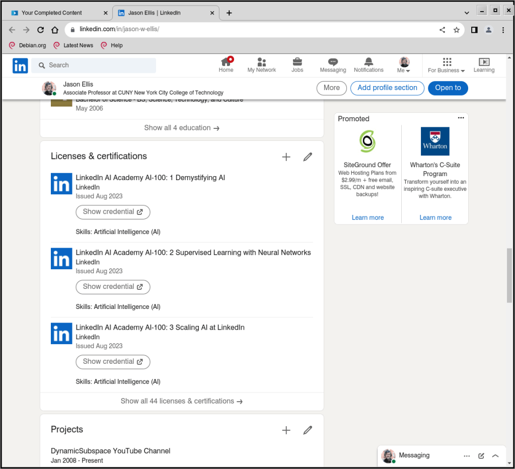
Remember to add each completed LinkedIn Course and Learning Path certification to your profile. They will appear in their own section as they do on mine shown above.
Completed Courses and Learning Paths do not automatically appear on your profile (consider: someone might not want all of their training to appear on their LinkedIn Profile for a variety of reasons).
To add a Course or Learning Path to your LinkedIn Profile, go to LinkedIn Learning > click “My Learning” in the upper right corner > click “Learning History” under “My Library” on the left > click the “. . .” to the right of the Course or Learning Path > click “Add to Profile” and follow the prompts.
LinkedIn also gives you the option to create post on your Profile about your accomplishment, which you should opt to do. When you do this, it auto suggests skills that it will add to your Skills section of your Profile. You can have up to 50 skills on your profile, so keep track of what’s there and prune/edit the list as needed to highlight your capabilities for the kinds of jobs that you are looking for. More on Skills further down the page.
Add Certifications to Your Resume or CV
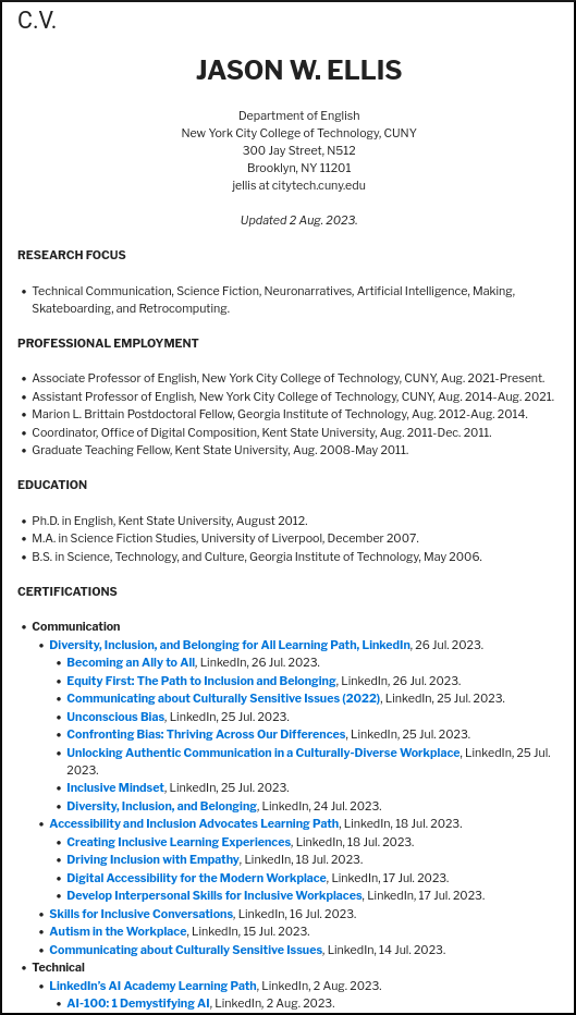
As shown above and viewable on my CV here, I added links to my LinkedIn Course and Learning Path certifications in a dedicated section of my CV. In addition to the unique link to my certifications, I included the organization that issued it (i.e., LinkedIn), and the date of completion. You can do the same on your CV or resume.
To get the link to a Course or Learning Path completion certificate, go to LinkedIn Learning > click “My Learning” in the upper right corner > click “Learning History” under “My Library” on the left > click the “. . .” to the right of the Course or Learning Path > click “Download certificate” > click “LinkedIn Learning Certificate” > toggle “On” under the top section titled “Create certificate link” > Click “Copy” on the far right.
While you are here, you can download a PDF of your certificate for safe keeping at the bottom left of this last screen. You can add these PDFs to a professional portfolio or alongside a deliverable that you create based on the skills that you gained from that course to demonstrate your learning and mastery.
Demonstrate Your Skills
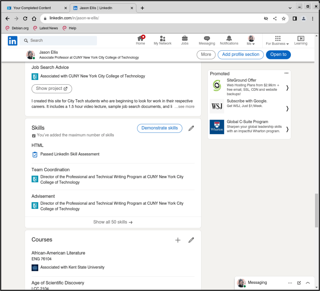
As I mentioned above, when you post about completing a course, LinkedIn Learning can autogenerate relevant skill terms to add to the Skills section on your Profile (as shown above on my Profile). When you have the spare time and focus, you should occasionally click on “Demonstrate skills” (you can do this without a LinkedIn Learning subscription). This gives you options for taking exams related to different skills that you’ve added to your Skills section of your Profile. If you pass, it provides some proof that you know something about that particular skill. Beware though: these exams can be tough. When I took the HTML exam, I discovered big gaps in what I knew from learning HTML years before without keeping up with changes to HTML in the intervening years. While I passed the exam, I made notes about those questions that I got wrong so that I knew what to learn more about to fill in those gaps.
Also, some skills don’t have exams associated with them. In those cases, you may submit a video or essay to demonstrate your experience to potential recruiters or hiring managers. If you do this, you should plan it out, shoot and edit your video to give the best visual and auditory impression, or write and revise your essay so that it is of the highest professional quality.
Is It Worth It?
Looking back on what I learned, how I learned it, and who I learned it from, I’m glad that I invested the time and energy into a month of LinkedIn Learning. I’ve already started putting some of the lessons into practice (e.g., the generative AI and ethical AI courses), and I’m planning out how I will roll out the DEI approaches in my courses when I return to teaching in Fall 2024 (I am on sabbatical this academic year). In the future, I plan to pay for LinkedIn Learning when additional classes are available and I have the time to immerse myself in learning.
If you’re looking to skill up, I think that LinkedIn Learning can be beneficial if you go into it with a learning and reflective mindset. This means that you are willing to invest your attention, time, energy, and thought to learning the course material, want to reflect on how what you learn connects to other things you’ve already learned through school and work experience, apply what you’ve learned to deliverables that demonstrate you have integrated what you have learned (e.g., a detailed post on your LinkedIn Profile, a blog post, a poster, a video, an addition to your professional portfolio, etc.), and reflect, preferably in writing, on what you’ve learned, how you applied it, what you would like to see yourself accomplish next, and how to take those next steps.
As I said above, you likely won’t gain much by passively listening to LinkedIn Learning Courses while doing other things or being distracted by your environment. Invest in this form of learning and you will add to what you know and can do. In that spirit, it’s like my Grandpa Ellis used to tell me, “Jake, no one can take away your education!”